Poster
 The poster tells the audience what the genre of the film is through colour and images. The character positioned in the centre of the poster, above the city skyline, illustrates the theme of hierarchy suggesting the film is about the levelling of class and status. Our film is a gangster film, which commonly employ themes of positioning and status.
Posters that were similar to ours and we generated ideas form were New Jack City and Inception.
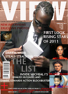
The central image we used on our movie magazine also represents the genre of the film as being gangster. Although we did not use the same character, all our characters wear a similar costume. We used a different character to the poster because we didn't want everything to just be the same, but at the same time we wanted to achieve continuity between products and present a strong marketing strategy.
The image shows one of the characters slipping a piece of paper into his inside pocket. If a potential audience member had previously seen the trailer or the poster, they would be aware that this prop is 'the list.' Here we tried to use this image as a repetative motif. These aides the readers’ interest to read on so they may know what the film is about, and possibly, what is written on the “list”.
The fonts and colours we used for our magazine cover, trailer and poster were all the same. The title 'The List' was always writtern in white/grey so as to be recognised easily by the audience. I think that our products do a good job of advertising the same products and looking like a package. The genre is clear in all of them, as are the themes that the film has. They all clearly draw on the theme of power, status level and authority. Both the main characters, Darryl and Michael, are featured in the trailer and one character has been used in each of the ancilary tasks.
If we were to improve these products i think that we could have made the font that we use a bit more interesting, as it does not stand out, especially in the colours that we chose. This would of made sure we caught the audience's attention successfully and made a profit with our film. Maybe using the same main character on all the products would of been more effective too, athough sometimes campagines use different characters to front their marketing, so it is debateable whether this would have bettered our work.
If we were to improve these products i think that we could have made the font that we use a bit more interesting, as it does not stand out, especially in the colours that we chose. This would of made sure we caught the audience's attention successfully and made a profit with our film. Maybe using the same main character on all the products would of been more effective too, athough sometimes campagines use different characters to front their marketing, so it is debateable whether this would have bettered our work.


