Friday, 6 May 2011

How did you use new media technologies in planning and constructing your media product?

Cameras

We used HD (High Definition) video and still cameras. The stills cameras were used to capture the images we wanted to use on our magazine cover/film poster and we took these during filming.

The HD camera equipment had good light settings so was good to use whilst filming during the evening. We set the white balance and exposure so that enough light would be let in, whilst at the same time keeping it low key. Some of the advantages of using digital technology rather than analouge are that it makes the creative process easier and editing can be more experimental as you can always undo any decisions that do not work. The final product is also easier to distribute i.e. via the Internet, or uploaded onto YouTube etc. Another advantage is that you can shoot then re-shoot footage without wasting materials - this saves money and allows you more control over film making process. We made the most of all these advantages whilst using this equipment.


Editing Software

This helped with the construction of our media product because it allowed us to create a variety of effects that helped define the form and style of our trailer. The editing software that we used for our trailer and print work was Premier Pro/ Adobe Photoshop and Sound Booth. On Sound Booth we used the loops to replay the same sound which was then imported into our film trailer to ensure the soundtrack flowed evenly and was in sync with the action. We also looked at the decibel level of the track, which we lowered so that the soundtrack was not overpowering.

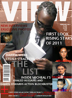
Photoshop enabled us to edit the film poster and magazine cover. We did this by using different tools and making layers for each in order to do things such as create text, change the size of the canvas and import found images (i.e. a barcode/celebrity shots) to make it look like a legitimate magazine cover. The advantage of these type of software is that there is no limit to how many different copies of the product you can make - you can go back and edit it at any time and change as many things as you want and save it under a different name so you don’t lose the original copy. We made multiple copies of each product and then showed them to our traget audience to get feedback on the one they thought was most effective. They used different colours, different fonts and different layouts etc.


(Looping tools on Adobe Sound Booth )


(Decibel and pitch bender sound grid on Adobe Sound Booth )


( Layers of individual items on Adobe Photoshop)


 (Different tools used in order to create magazine cover and poster including magic wand, crop, text, move and blur)


Wednesday, 9 March 2011

How effective was the combination of your main and ancillary tasks?

Poster

The poster tells the audience what the genre of the film is through colour and images. The character positioned in the centre of the poster, above the city skyline, illustrates the theme of hierarchy suggesting the film is about the levelling of class and status. Our film is a gangster film, which commonly employ themes of positioning and status.


Posters that were similar to ours and we generated ideas form were New Jack City and Inception.


Magazine

The central image we used on our movie magazine also represents the genre of the film as being gangster. Although we did not use the same character, all our characters wear a similar costume. We used a different character to the poster because we didn't want everything to just be the same, but at the same time we wanted to achieve continuity between products and present a strong marketing strategy.
The image shows one of the characters slipping a piece of paper into his inside pocket. If a potential audience member had previously seen the trailer or the poster, they would be aware that this prop is 'the list.' Here we tried to use this image as a repetative motif. These aides the readers’ interest to read on so they may know what the film is about, and possibly, what is written on the “list”. 


The fonts and colours we used for our magazine cover, trailer and poster were all the same. The title 'The List' was always writtern in white/grey so as to be recognised easily by the audience. I think that our products do a good job of advertising the same products and looking like a package. The genre is clear in all of them, as are the themes that the film has. They all clearly draw on the theme of power, status level and authority. Both the main characters, Darryl and Michael, are featured in the trailer and one character has been used in each of the ancilary tasks.

If we were to improve these products i think that we could have made the font that we use a bit more interesting, as it does not stand out, especially in the colours that we chose. This would of made sure we caught the audience's attention successfully and made a profit with our film. Maybe using the same main character on all the products would of been more effective too, athough sometimes campagines use different characters to front their marketing, so it is debateable whether this would have bettered our work.  

Friday, 4 March 2011

How did your media product use develop or challenge forms of real media products?

Our film teaser uses several camera techniques that are similar to real film teasers. These different types of camera techniques are used to build up tension depending on the genre of the film. For example, our film genre is based around action/ thriller/gangster so you would expect to see a variety of fast shots and edits to build up the atmosphere.  For our preparation we researched thoroughly different film teasers that are based in the action/thriller genre. We found out that the two films we were inspired from were Inception and Memento. These two films share the same media conventions as our film teaser.

In this medium long shot, the man in the grey suit is being dragged away by two henchmen towards a helicopter. I think the background is important here as you can see that there are lot of high rise buildings. This sets the scene as the audience quickly realise that this scene may involve some action as the signs in the background indicate danger in an urban setting. Also, the man being dragged away shows that the teaser may involve some kidnapping of some sort. The victim looks vulnerable and weak whilst the two body guards look strong and powerful. We chose to use this camera shot in a different way, as we believed that it would help link our film teaser to the genre of action/thriller. The mystery of a man being dragged away built up mystery and tension in our trailer and i believe we used this shot effectively to make the audience question why he was being kidnapped and who by.


( Our mid shot of the character walking and someone talking on the phone)


                              (Above: our use of titles to build tension and explain the story)

In these screenshots used from our film teaser ‘The List’, the titles are used and than there are a couple of shots afterwards. We chose to use this technique similar to ‘Inception’, as using the words 'one name.' This was used to give the audience the idea of there being a special or 'chosen' character and also hint at the idea of some sort of mission that he has to go on. I think the use of these titles was effective in conveying the right amount of information to the audienece.

One thing i regret is that we did not really try and challenge any media conventions. We used strerotypical representations, and although our trailer fitted perfectly within the genre, one criticism may be that we followed conventions so much that it was no longer very original.

Another way we were inspired by the film Inception and Memento was the use of titles in the teaser trailer. The titles used in both film teasers narrate the film so that the audiences can get a idea of what the film is about (content/narrative/ themes)

In this screenshot used from the film Inception the title ‘your mind is the scene of the crime’ is used to convey the psychological theme in the story to the viewers.  The title is used to give a sense of direction so the audience know what the film has to offer to them. By putting myself in the shoes of the audience I would straight away think that the film Inception may be a psychological thriller as the use of the word ‘mind’ means that the viewer may have to do a lot of thinking in this film. The word ‘crime’ is associated with action; drama so the straight away as a member of the audience you may think this is an action/thriller.

What did you learn from your audience feedback?


According to the results we got a lot of positive views from our audience. We received various comments from our trailer both what was good about the trailer and what could be improved about the trailer. The way we gathered this information was by using the Internet and social networks i.e. Facebook and Twitter. Out of 92 people 45 gave us some feedbacK.

This list of improvements to be made included suggestions such as blend in the sound a bit more to give a smoother feel. The use of a voice over would help give more direction and meaning to the trailer. Using some more text would have helped give a better understanding of the narrative of our film. Out of the feed back we gathered the main issue that was brought up was that way the sound was blended in poorly and the fact some more text could have been used during the teaser trailer. 


Feedback given to us by audience members about the trailer from the website YouTube.
Make the fade in/fade out a bit longer. To make it more mysterious. It seems lyk u cutting.especially wen u passing the envelope. (Notice how horror movies have these long fade ins or fade outs. or really fast cuts. To bring up tension....)
y was there a shot of a phone ringing? Dat was a bit confusing lool
and u see wen it says 'on...
See more


                        CREATOR: gd-jpeg v1.0 (using IJG JPEG v62), quality = 95


                        CREATOR: gd-jpeg v1.0 (using IJG JPEG v62), quality = 95


            Dairelle Underrated Edwards Jheez jokers 12 February at 20:26
              Like · 1 person                   


            Write a comment...


Please give us feedback it's first video I need to asses thanks reasonable feedback please 


            Migena Love and Felix Nytz In-allWays like this.
           
                        CREATOR: gd-jpeg v1.0 (using IJG JPEG v62), quality = 95
                        

                  Felix Nytz In-allWays siccccka!11 February at 20:04 · Like               
                        CREATOR: gd-jpeg v1.0 (using IJG JPEG v62), quality = 95


                             Dairelle Underrated Edwards Thank you good feedback11 February at 20:09 · Like                     
                                            CREATOR: gd-jpeg v1.0 (using IJG JPEG v62), quality = 95
                                           
                       
                              Felix Nytz In-allWays you are welcome, my don11 February at 20:11 · Like                      


Comments form the social network Facebook.

We also filmed audience members watching our product and recorded their feedback We found that the results were similar. These findings are vital for future reference to help build a stronger trailer and one that will capture attention from the audience more.